Game Data

Here we present some of the data used to generate versions v2 and v3 during Phase 2.

If you're looking for results for the GEQ and Panas (Phase 3), please click here.

Summary

1. Questionnaire

2. Replays

3. Aggregated Visualization

1. Questionnaire

We fragmented each level into smaller challenges, totaling 18 challenges. Participants responded in a 5 item Likert scale how difficult was each challenge, ranging from 1 ("Too easy") to 5 ("Too Hard"). We compare the results from the Likert scales with the designers' expectations (cells marked gray).

2. Replays

By syncing timestamps, we can see replays of gameplay sessions and change colors of portions of the screen according to where players were looking at the time. The colored portion represents to which portion a player is looking to. The black one represents the portion a player was not looking to. This visualization, however, is only suitable for specific segments of gameplay. Some full replays might last hours, therefore requiring an unreasonably long time to watch.

3. Aggregated Visualization

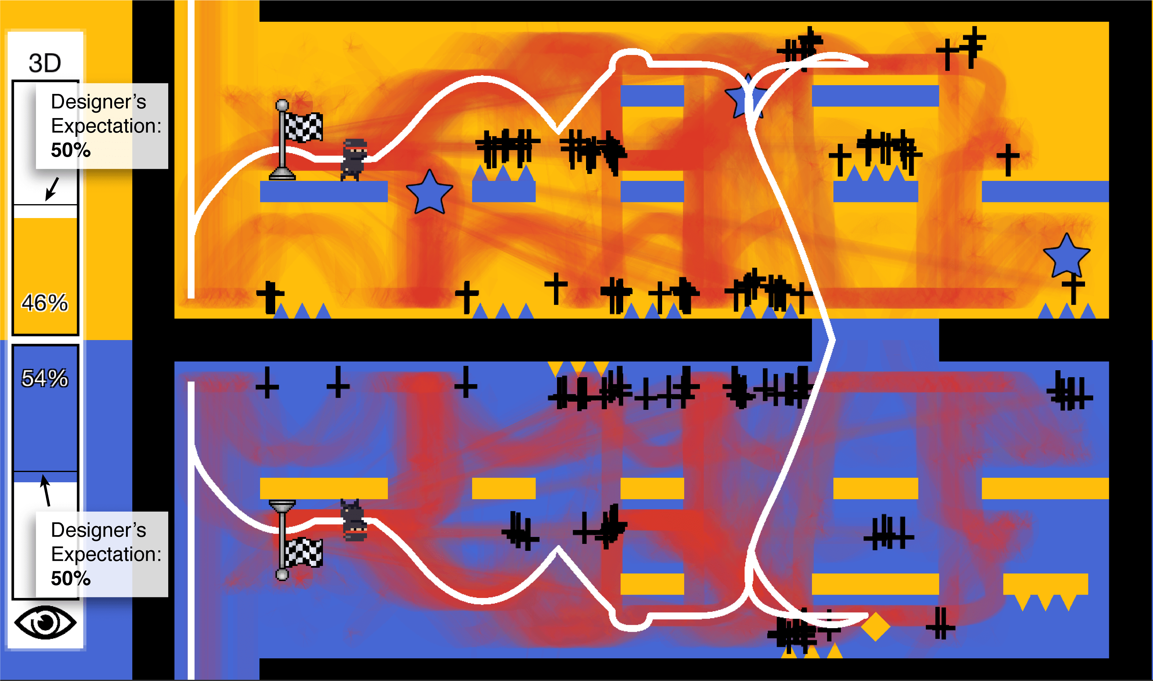
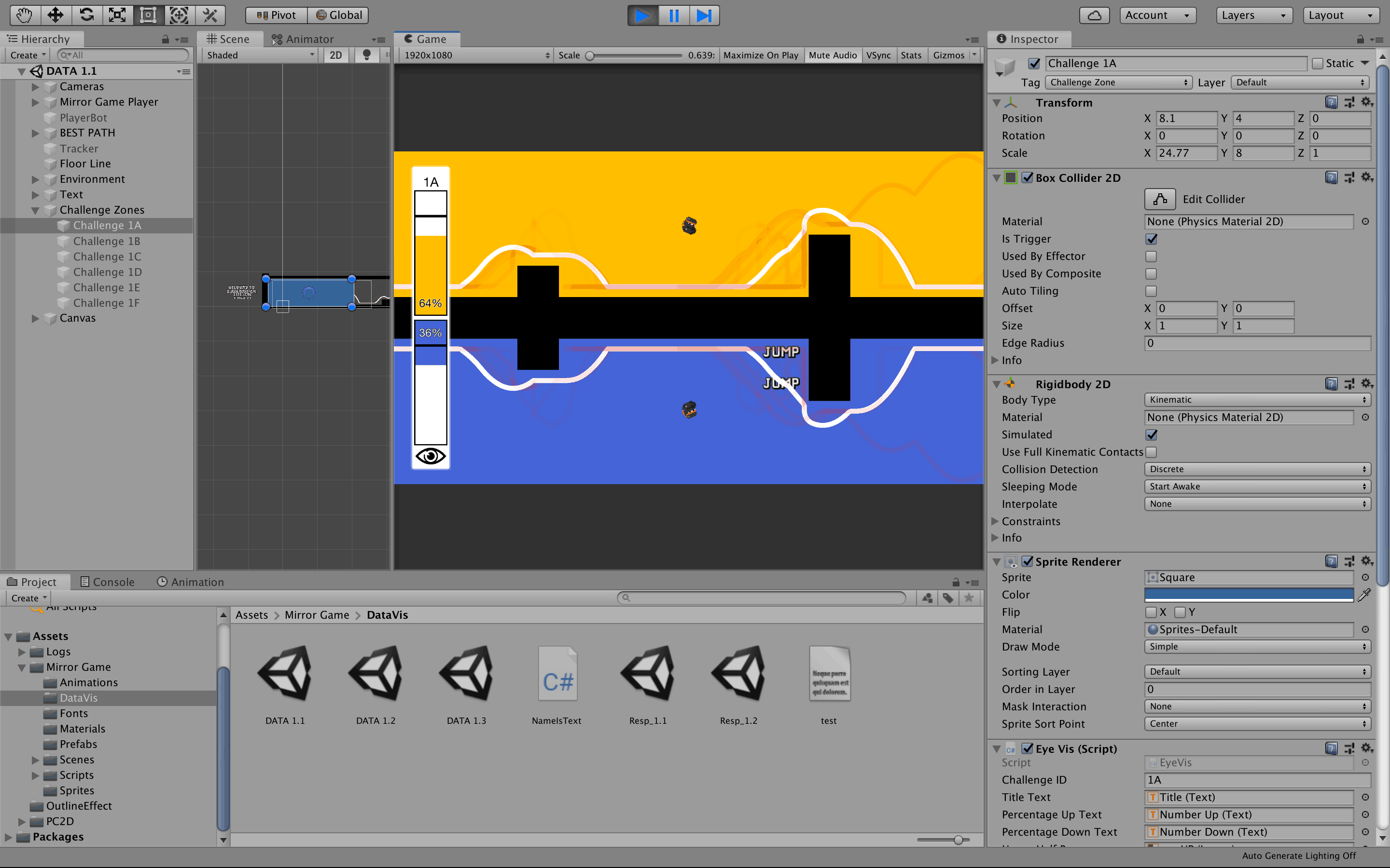
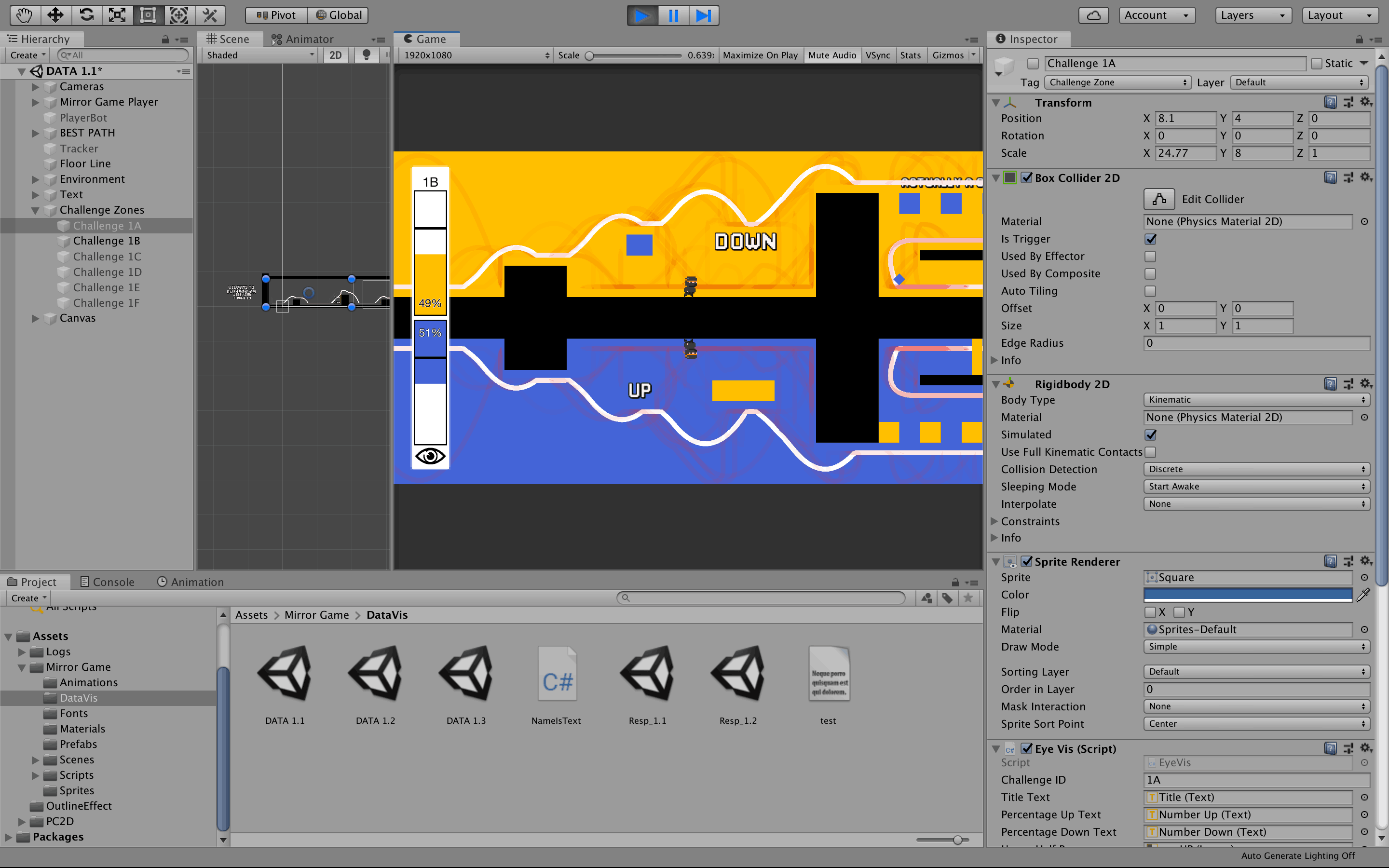
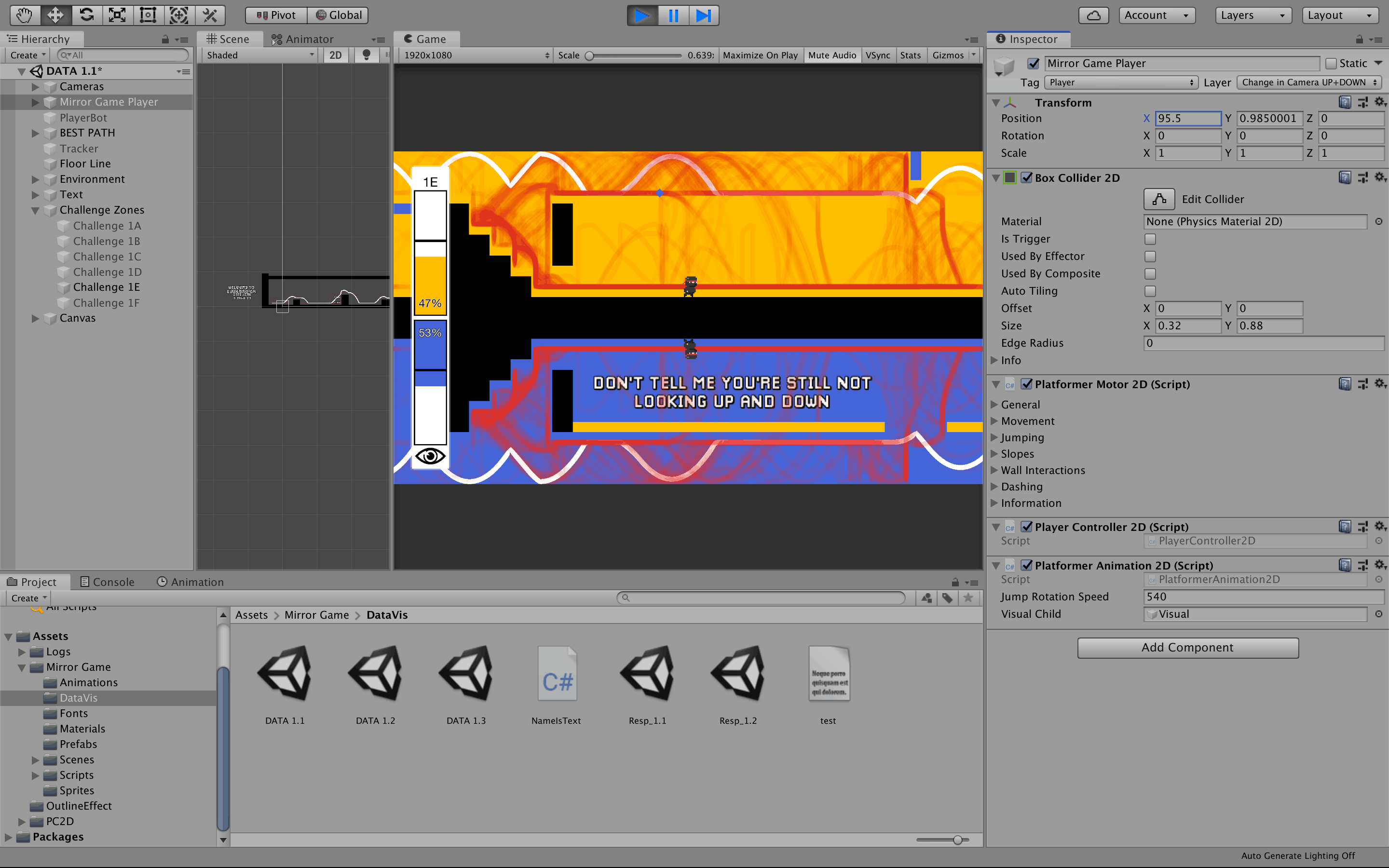
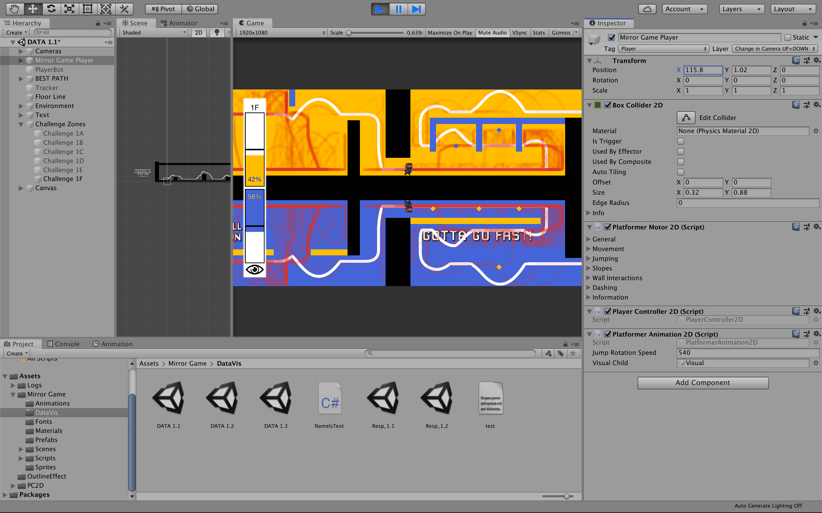
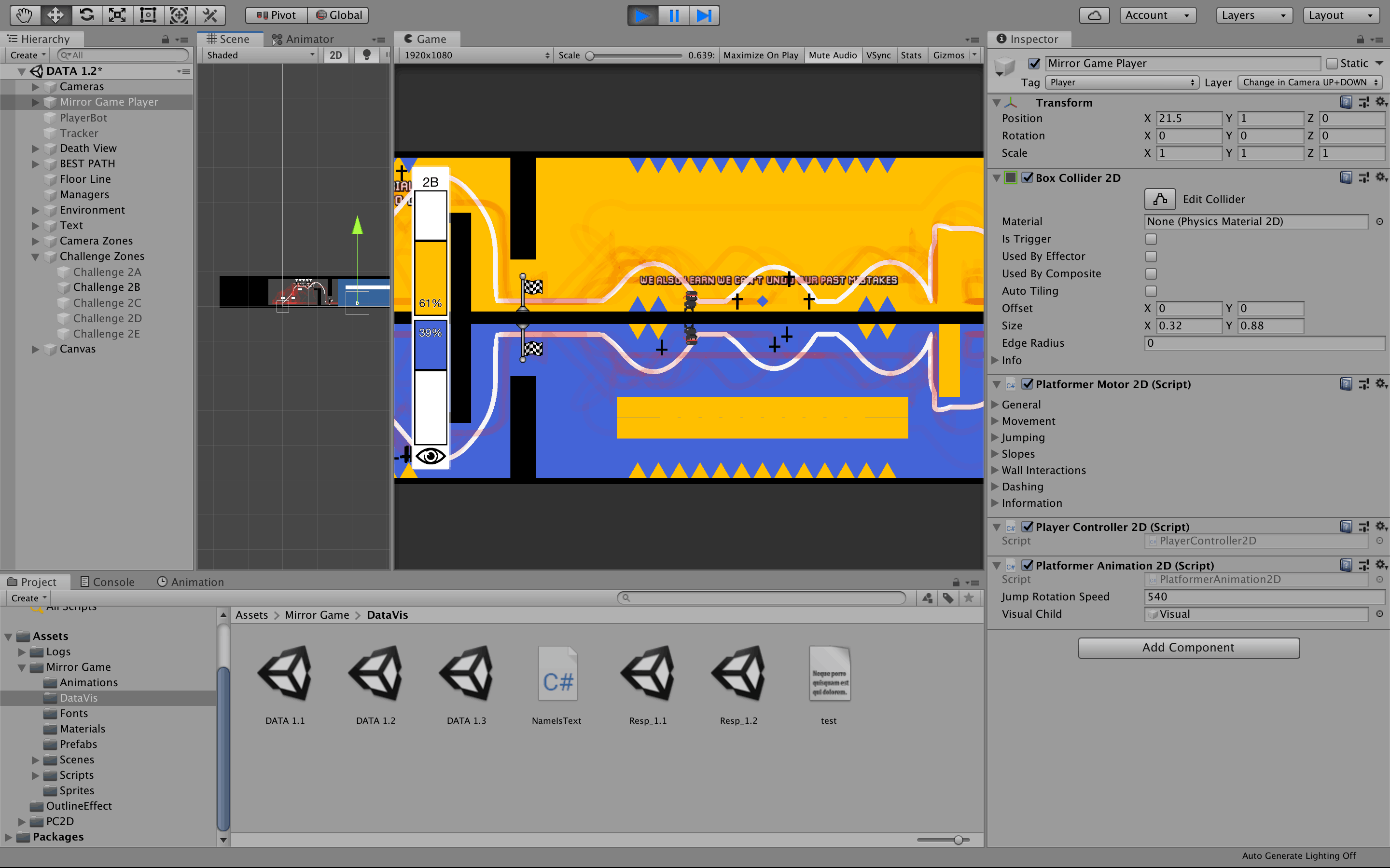
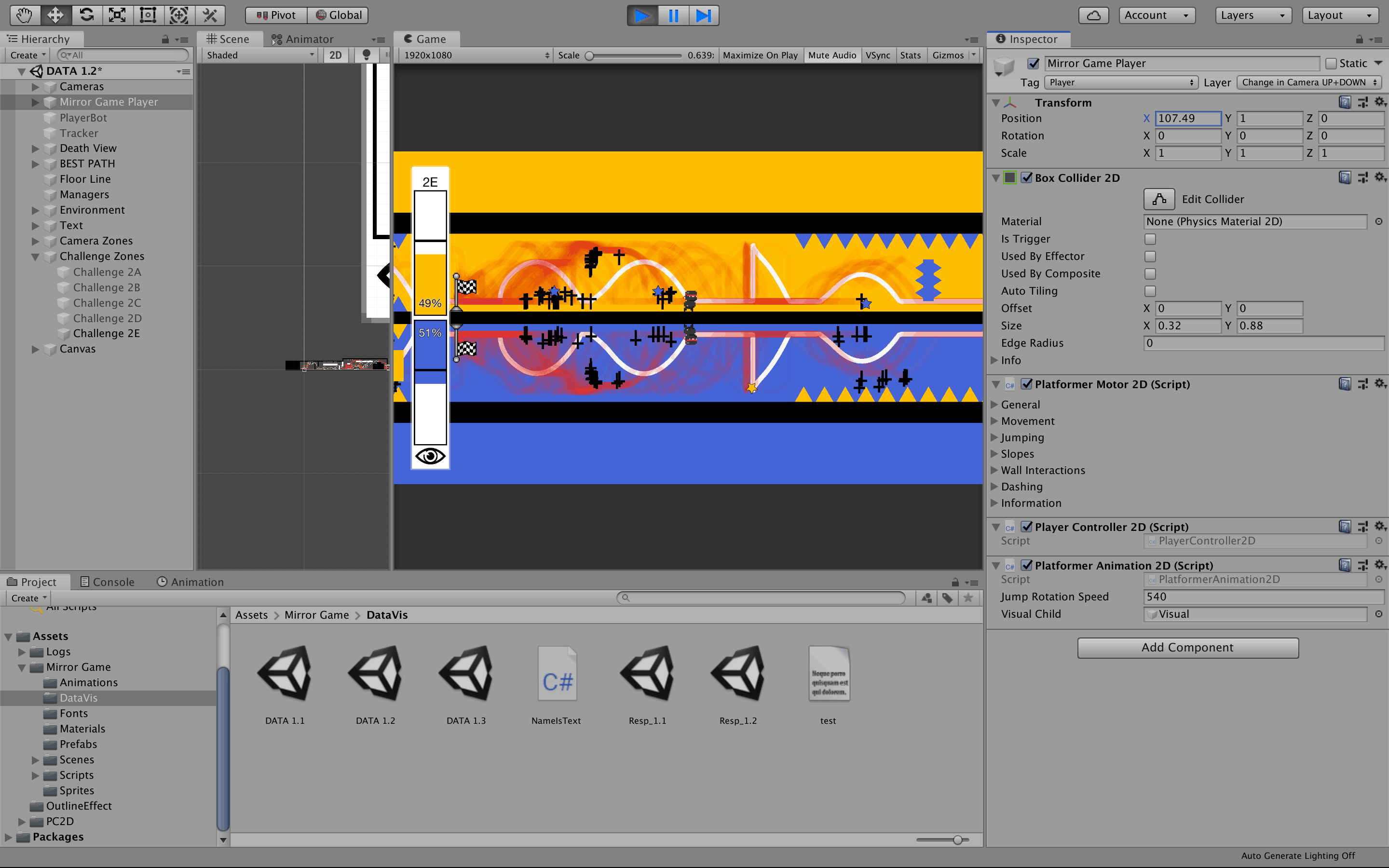
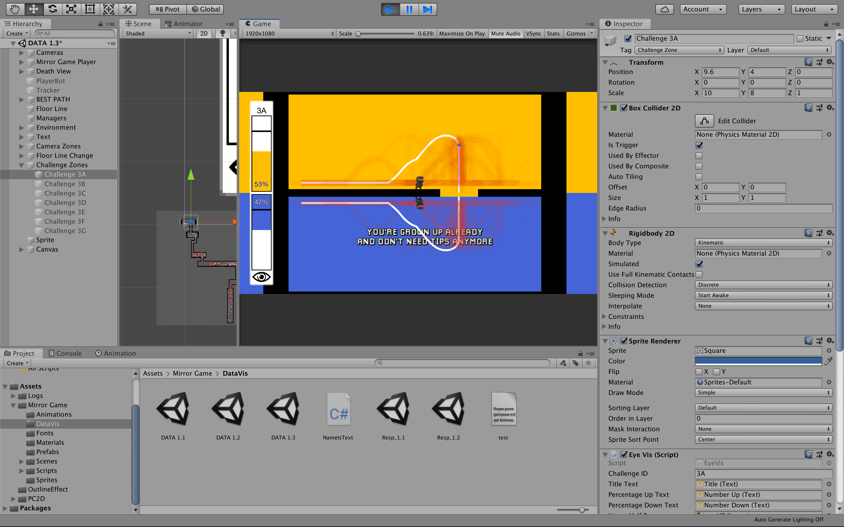
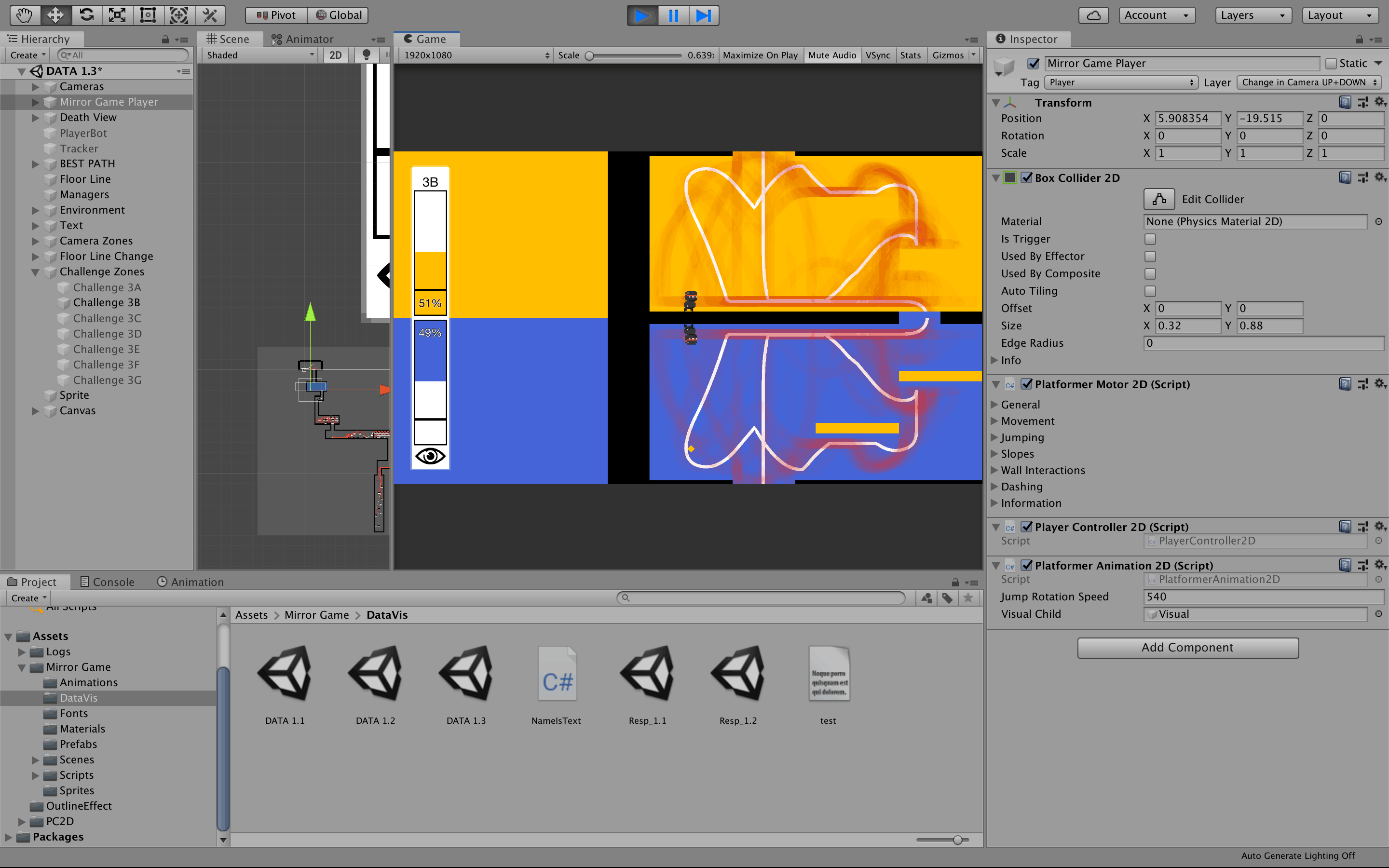
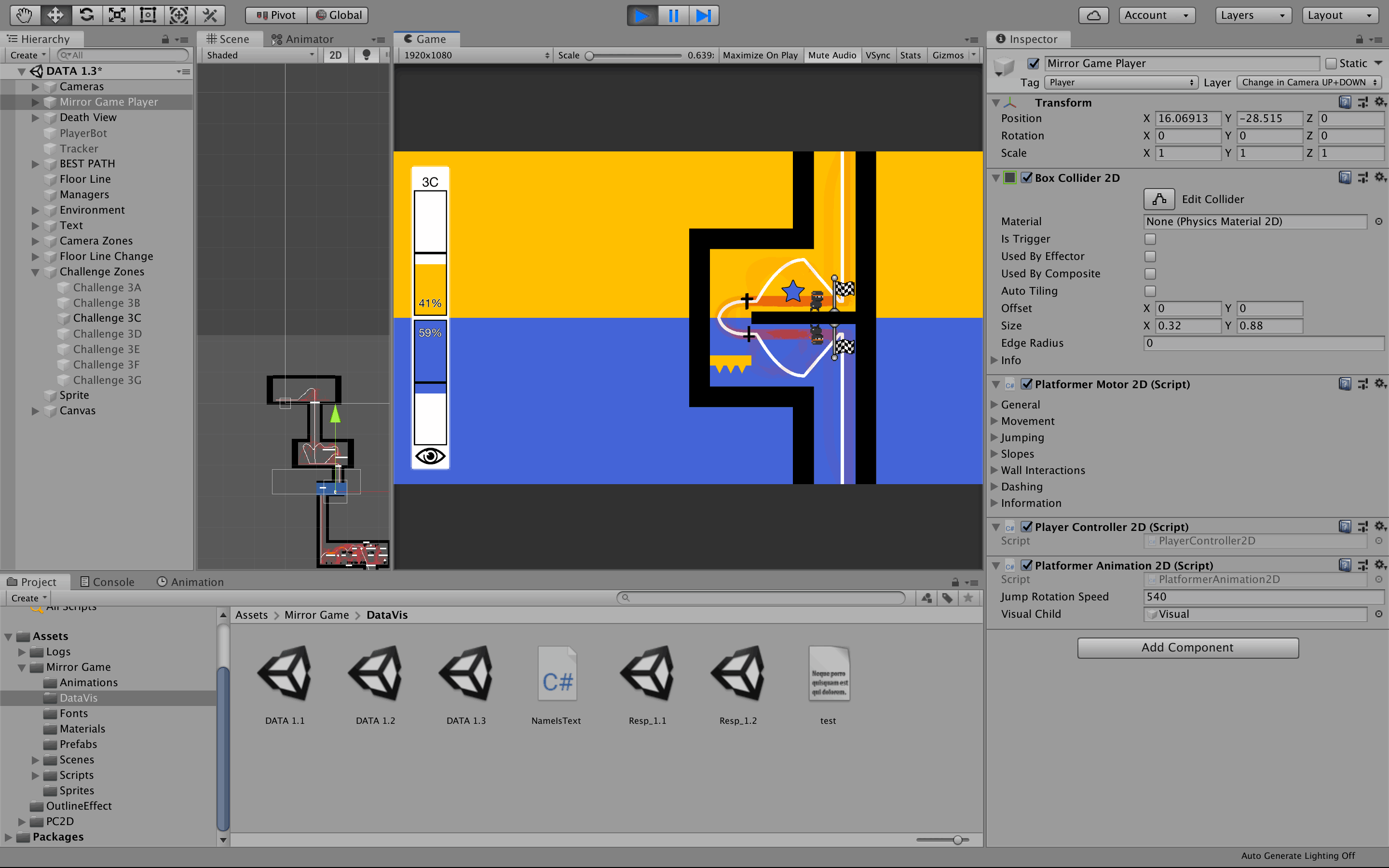
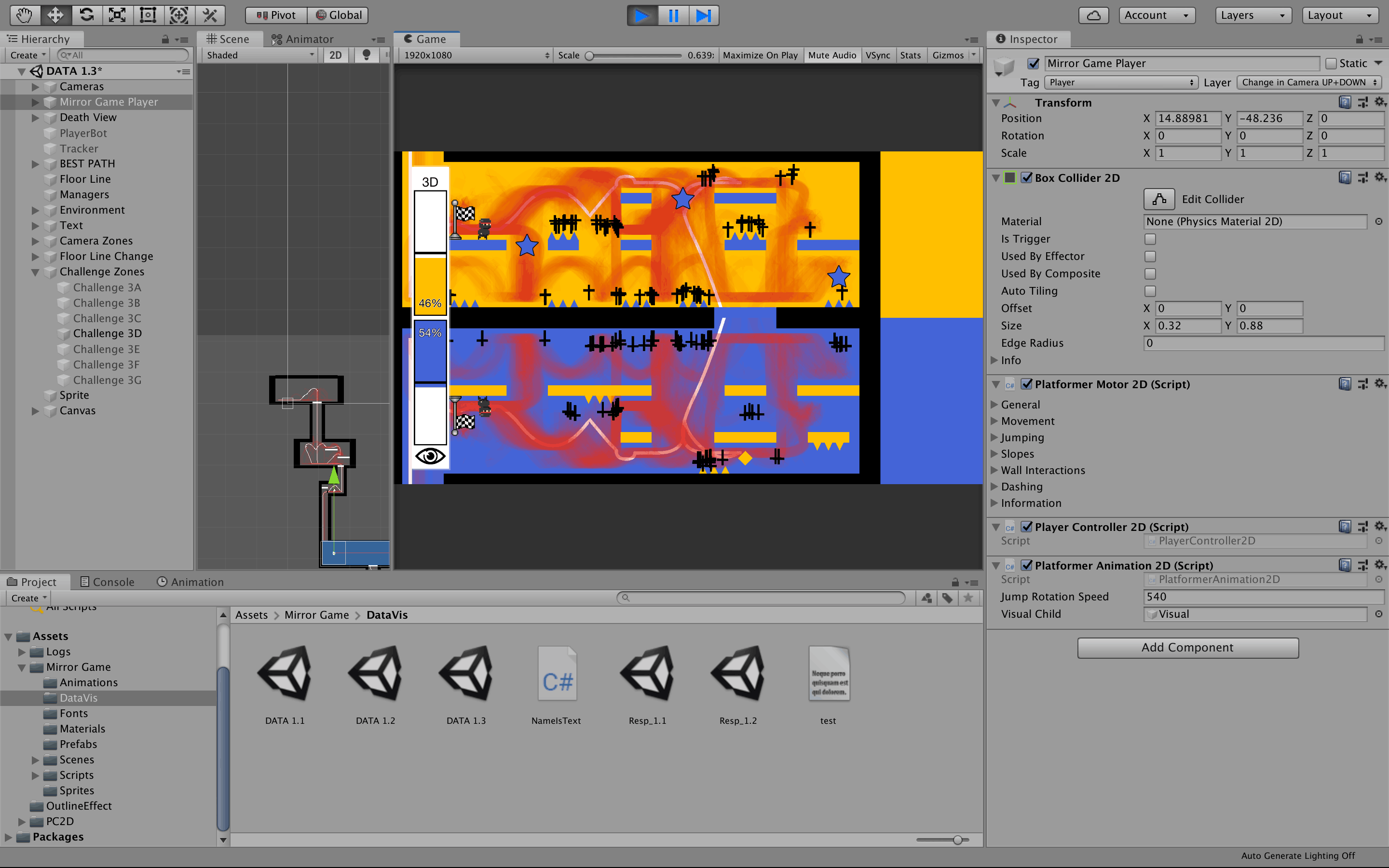
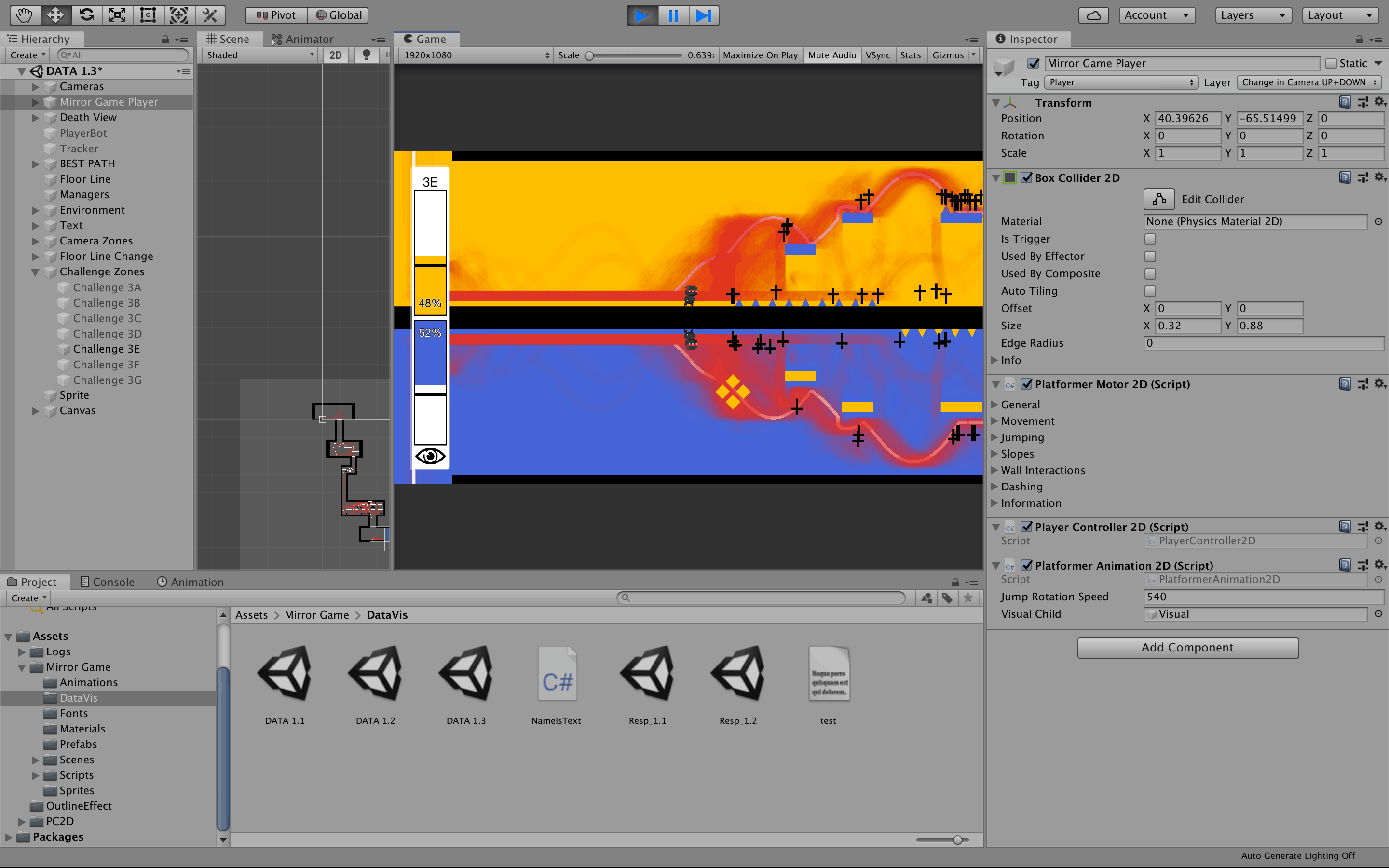
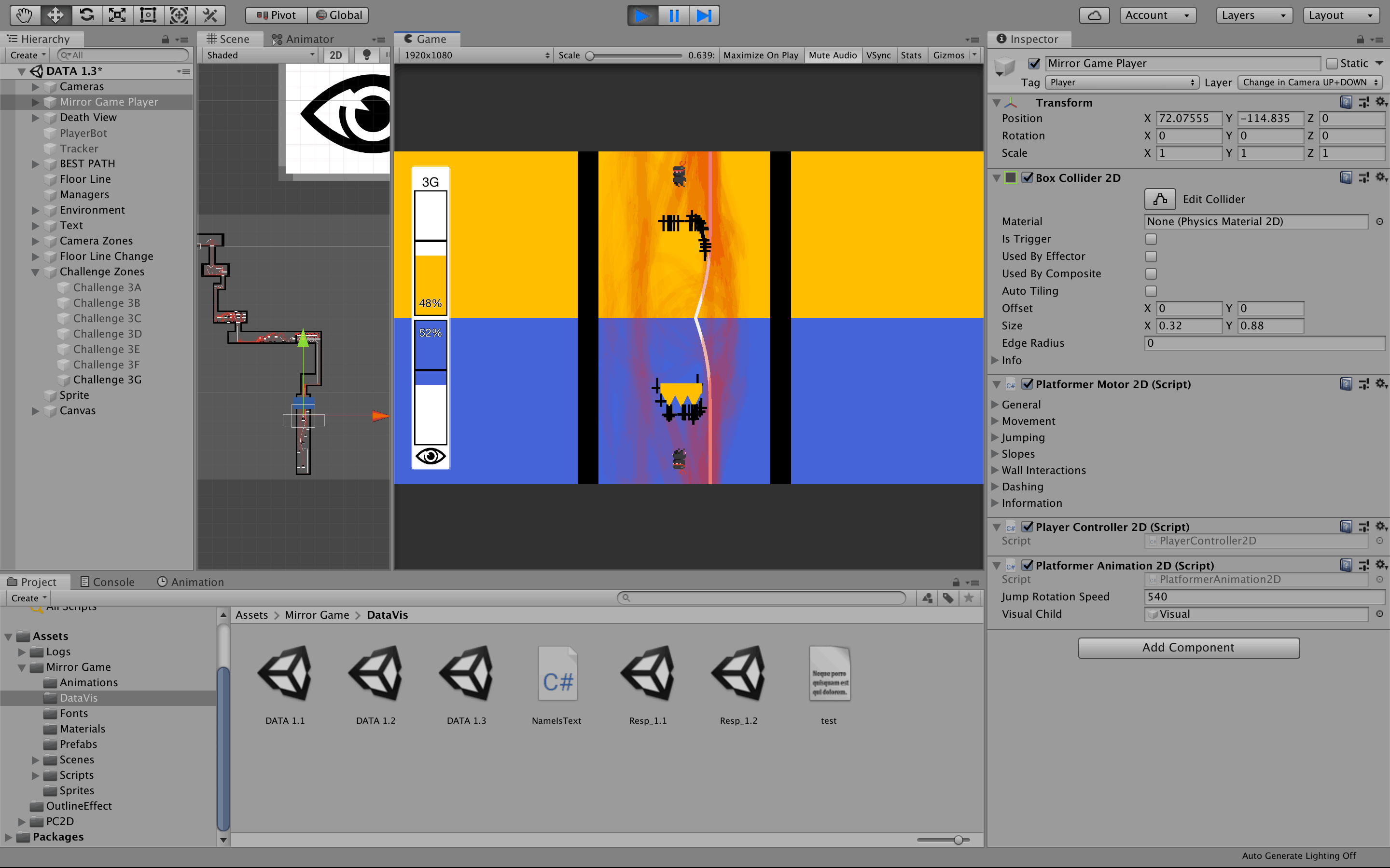
To better understand overall behavior, we developed a visualization that aggregated for all users every variable relevant for this research:

  • - White path: ideal trajectory for each level
  • - Red paths with a low alpha value: actual paths performed by the participants
  • - Black crosses: location of players' deaths (if a cross appear in the lower screen, for example, a player died in that place while looking down)
  • - Mirrored bar charts: distribution of gaze per challenge
  • - Black solid line in the bars: expected gaze distribution

The data used to generate these visualizations can be accessed below. The data is organized as follows: first column shows the timestamp, second column shows the XY coordinates, and the third column shows to which screen the user was looking at (1 = up, 2 = down).

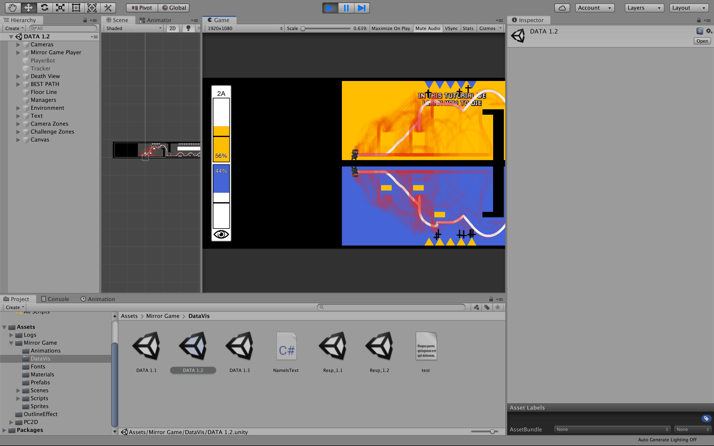
Screenshots showing every generated visualization are available below.